Dashboard
Filters
Teams Filter
The Teams Filter allows you to focus on specific teams within your organization. To use it:
Click on the Teams Filter.
A dropdown menu will appear, displaying all available teams.
You can select multiple teams from the list to customize the dashboard view.
To clear the filter, click on “clear” on the dropdown
By default, the dashboard displays data from all teams within your organization.
Date Range Filter
The Date Range Filter enables you to view data within a specific time frame. To use it:
Click on the Date Range Filter.
A Calendar will appear in the dropdown, allowing you to choose any duration, starting from one day up to the last date allowed based on your applicable data retention period.
Select the From date and To date or click on any preset date range available on the left of the dropdown
By default, the Date Range Filter is set to display data for the "last 7 days."
Please note that the data retention period is defined as per your license agreement.
For more information on data retention, please visit <link>.
Widgets
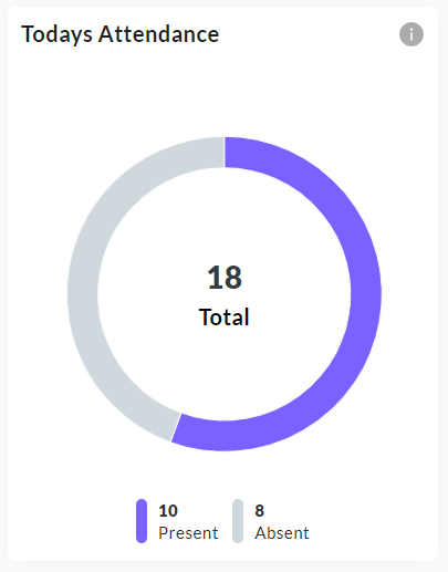
Today's attendance
Today’s attendance widget displays the today’s total attendance for the filtered team(s).
This widget is unaffected by the date-range filter as it always displays today’s attendance only.
It serves as a one-glance indicator for team(s) attendance. For more information on the employees who are present today, click on “Datewise attendance” tab next to the detailed tab.
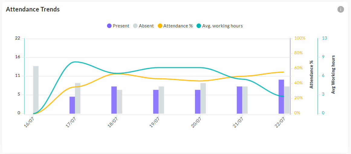
Attendance trends
This mult-graph charts the number of present and absent employees using a grouped bar graph and attendance percentage, average working time as line graphs.
The primary Y axis is meant for the present/absent bars
There are two secondary Y axes, one meant for attendance % (0-100%) and another meant for average working time (in hrs)
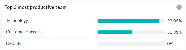
Most productive team(s)
This widget lists the most productive team(s) according to the applied Teams filter. Upto three teams can be shown here, arranged in the decreasing order of their respective productivity percentages.
For ex. - If one team (Technology) is selected in the Teams filter, then the widget will only display that team and its productivity %. If three or more than three teams are filtered, then the top three teams will be displayed.
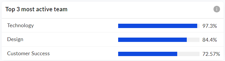
Most Active team(s)
This widget lists the most active team(s) according to the applied Teams filter. Upto three teams can be shown here, arranged in the decreasing order of their respective activity percentages.
For ex. - If one team (Technology) is selected in the Teams filter, then the widget will only display that team and its activity %. If three or more than three teams are filtered, then the top three teams will be displayed.
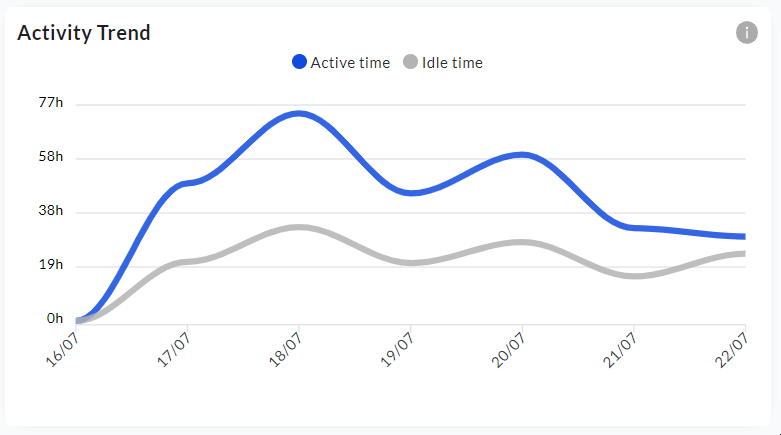
Activity trend
This multi-line trend graph displays the trend of active time and idle time over the filtered date range for the selected team(s)
Dates are on the X-Axis and Active/Idle Time (in hours) on the Y axis.
Hovering on the graph displays the active/idle time detail for each day in the filtered date range.
For more information on how active/idle time is calculated, click here
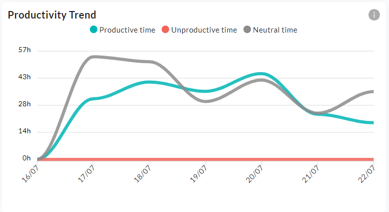
Productivity trend
This multi-line trend graph displays the trend of productive, unproductive and neutral time over the filtered date range for the selected team(s).
Dates are on the X-Axis and Time (in hours) on the Y axis.
Hovering on the graph displays the productive, unproductive and neutral time detail for each day in the filtered date range.
For more information on how productive, unproductive and neutral time is calculated, click here
Related Articles
Screenshots
The Screenshot feature automatically captures screenshots of employees' systems at predefined intervals exclusively during their punched-in hours. Once an employee punches out from MyZen, screenshots cannot be captured. The snapshot frequency is ...Activity
We360.ai 2.0 helps your employees be more efficient and provides valuable data to the management about how the employee works. Enable yourself to track and collect employees’ real-time user actions and behaviour data on company workstations. Our ...Livestream
We360.ai 2.0 Livestream dashboard reflects an employee's real-time work highlights. Get an overview of the employee’s work in the tile format representing the current app or URL used within a specified time and the current status of an employee ...Filters & Pin filters
Filters Introduction Filters are powerful tools within each feature of We360, designed to streamline your search process and help you find exactly what you're looking for. Whether you're analyzing team performance, group metrics, or individual user ...Timesheet
A timesheet is a structured way to record, track, and manage working hours. It helps users log tasks, track progress, and ensure accurate reporting of work done. Timesheets are not just for employees—managers and admins can also log their own work ...